Mental Health App
Clear Mind

Overview
ClearMind is a mental health app designed to empower users with personalized tools for well-being. It integrates various coping strategies into one intuitive platform, addressing gaps in existing solutions. Inspired by personal experiences, the app offers resources, support, and a community forum to enhance mental wellness. Extensive research and usability testing guided its development to meet users' unique needs.
Team
Sole Designer
Responsibilities
User Research
Wireframing/Prototyping
UX/UI Design
Usability Testing
Duration
Aug 2023 - Sept 2024
Problem
Current mental health apps lack personalization and comprehensive support, offering narrow solutions like meditation or mindfulness that fail to meet diverse user needs. This forces individuals to rely on multiple apps, resulting in inconsistent use and limited long-term impact on mental well-being.
Solution
I developed a personalized mental health app that adapts to users' unique emotional needs, complements professional care, and provides intuitive tools for both daily self-care and moments of crisis.


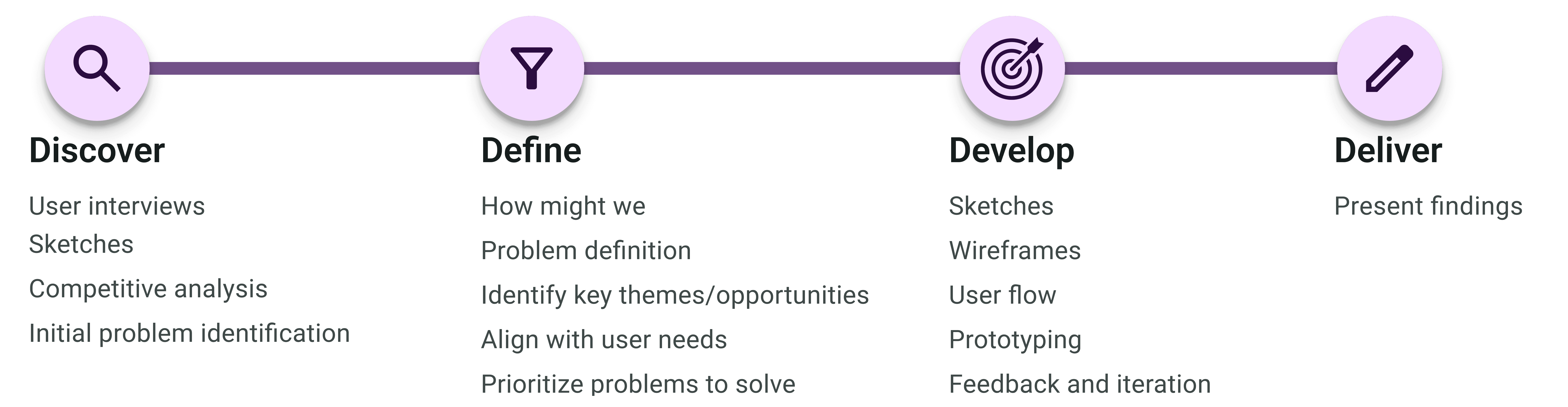
Design Process
After identifying the gaps in current mental health apps, I designed an application guided by user-centered design principles and created a low-fidelity prototype. I conducted user testing with five participants, incorporating their feedback to refine the design and ensure it addressed diverse mental health needs effectively. This iterative process led to the development of a high-fidelity prototype tailored to user preferences and behaviors
Interview Insights
I interviewed individuals currently battling mental health challenges in order to better understand the landscape of available resources, as well as how to best support users facing a wide range of challenges. This led to a last-minute suggestion to explore the app from the perspective of someone supporting a loved one, prompting additional interviews.


Competitive Analysis
My initial approach was to audit the top trending mental health apps in the app store. However, after discovering a website that ranked apps by specific 'best for...' categories, I realized this approach was more effective. It allowed me to analyze a broader range of apps, giving me deeper insights into the competitive landscape.

Design System
Incorporating Google’s Material Design laid the foundation for creating new components and interactions, ensuring a consistent and scalable user interface. This framework guided typography, color schemes, and iconography, enabling intuitive, accessible design elements across the app.


By leveraging Material Design's color system, I was able to create a consistent and intuitive color palette that aligns with mental health awareness. This system provided the flexibility to adapt awareness ribbon colors, enhancing the user experience and ensuring visual clarity throughout the app.

How Might We
By applying the "How Might We" method, I reframed the frustrations shared during the interview stage into actionable opportunities for design improvement. This approach allowed me to capture user pain points effectively and translate them into targeted solutions that addressed their needs.
User Flow
I also created a user flow to flush out the user journey, identify gaps, and validate assumptions, ensuring the design was intuitive and aligned with user needs. This process provided a clear framework for developing solutions that addressed user pain points effectively.

Sketches
I created a low-fidelity prototype to map out the core features and interactions of the design. This helped visualize the user experience and allowed for early feedback to guide further development.

Low-Fidelity Prototype
I created a low-fidelity prototype to map out the core features and interactions of the design. This helped visualize the user experience and allowed for early feedback to guide further development.
Usability Study
I conducted a usability study to gather valuable insights, focusing on how users interacted with the app and identifying areas for improvement. The study involved multiple testing rounds to assess different features and workflows, incorporating both A/B testing and real-world suggestions.

Design Iteration
Design iterations for the mental health app were driven by continuous user feedback and usability testing. Each iteration focused on streamlining navigation, clarifying content, and creating a calming, supportive interface. This process ultimately produced a user-friendly design that effectively meets the needs of its users.
I was having trouble with testers interacting with the bottom sheet, so I designed multiple variations of the 'Read a Book' screen. This allowed testers to try different options and provide feedback on which version felt most intuitive. Based on their input, I refined the design, which is now part of the app.

Testers liked the 'Daily Check-In' screen but felt it was too 'cold' and needed more color. Drawing inspiration from a designer’s use of gradients to represent emotions on a scale, I incorporated a gradient to better reflect emotional states, adding warmth and visual appeal to the screen.

I initially assumed users would use the TikTok videos from psychologists and mental health advocates as a starting point to explore further. However, testers wanted to know the topic being covered before clicking on the video. Based on this feedback, I adjusted the design to include topic labels for better clarity.
Final Design


Accessibility Considerations
Accessibility was at the forefront of every design decision, ensuring an inclusive experience for all. The app was built with usability in mind, making navigation and interaction seamless. By prioritizing accessibility, it fosters a space where everyone can engage with ease.


What I Learned
I didn’t realize how emotionally impactful the app would be for those I shared it with. It created a space where they felt comfortable enough to lower their guard. This allowed them to open up about their own mental health challenges. That’s when it truly became real for me.